Case Study - SF local travel Website with mix & match customization “Combo”
Your Special Friend
Your SF Summary
“Rating cities as ‘safe to live in or visit’ was 70% in Oct. 2006 declined to 52% in July 2023”
1. Background: This project was inspired by me and my friend’s (SF locals) business ideation. Because of the recent perception of SF from the media, SF travelers feel nervous, wanting locals to help planning trips. This SF Specific travel website will allow travelers to customize their trips, with blogs articles for local gems and safe suggestions. Assumed target users were already defined. At this time, only low-fidelity prototype is planned.
2. Emphasize, define: User persona, user journey map and market audit (Trip advisor, Klook, Viator, The destination designer, Golden Horizon)
3. Ideation & Problem-solving: Market audit supported these 3 service categories.
DIY trip
(—) Planning entire trip is too time consuming
(—) Need local to guide
(+) Customizable & Affordable
Fully guided trip
(—) No customization available within the tour
(+) Various options
(+) Guide’s local input
Fully Customized Trip
(—) Too expensive
(+) Customizable
(+) Guide’s local input
How might we (solution)
provide a service flow that accommodate all the positives from each service category?
-> Combo flow: Users complete a easy flow where they can mix & match tours and get discount/perks
4. Prototype:
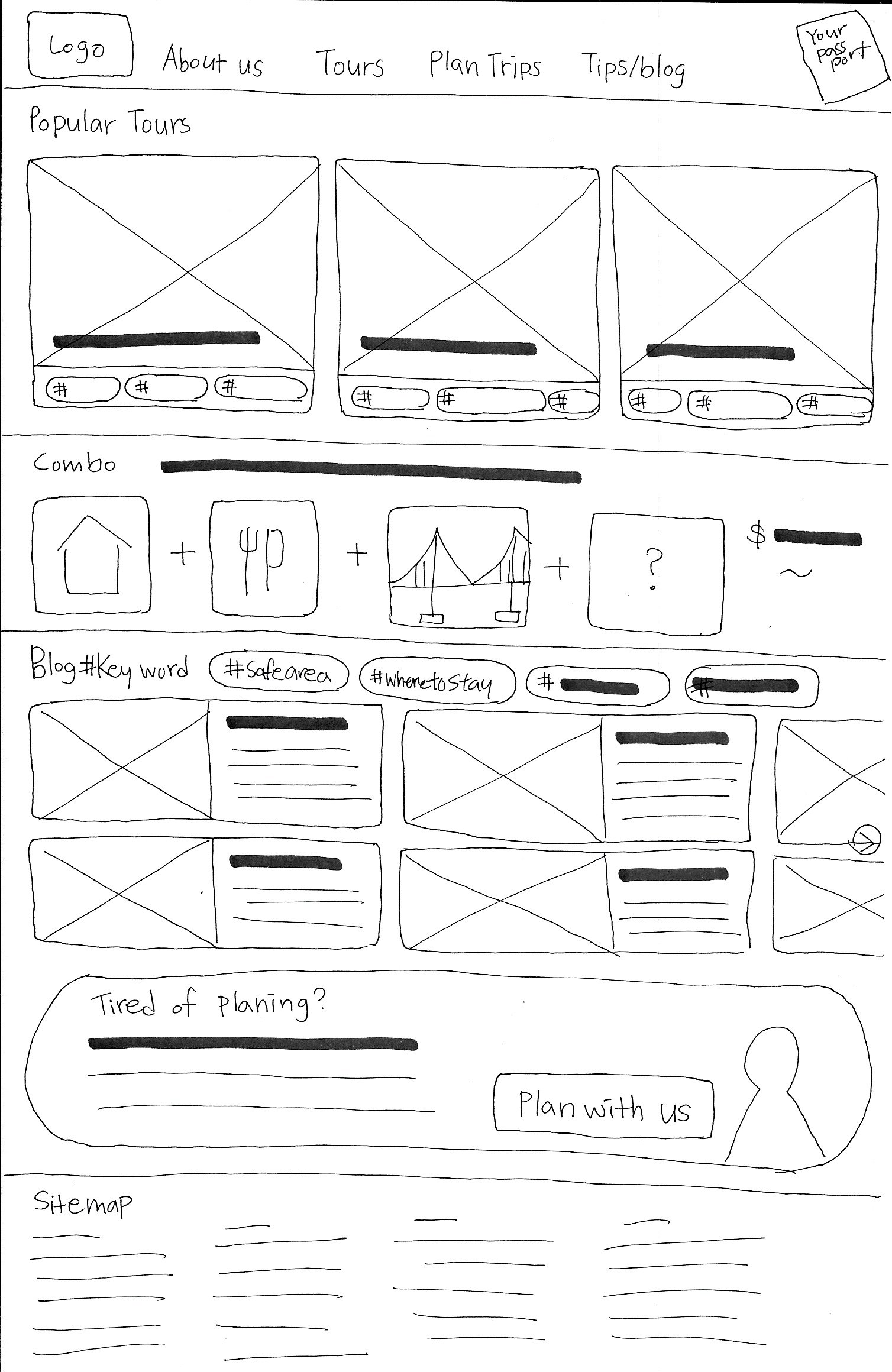
Based on the ideation, developed user flow & Information Architecture for wire framing/prototype


What did I learn?
5. Test & Improve: Through the user test findings were
Positive: Users liked Combo flow’s concept and structures
Where to improve:
Oversized components
CTA buttons are not visible w/o scrolling,
Keep users engaged to complete the task
Better understanding of WHY at each stage - Previously, I followed the steps because the curriculum dictated it. This time, I actively selected and engaged with each step—emphasizing, defining, and ideating—to truly understand the users and identify features that would help solve their problems. Through this process, the 'combo' feature emerged, which I hadn't anticipated at the project's inception.
Connecting solutions from user test insights - User test insights pushed me to rethink my original structure and design a better solution to address the problem. This iterative process challenged my initial assumptions and led to improved design choices.
Ensuring users know where they are - Despite having a progress bar, I realized that thoughtful visual navigation and clear information are crucial to keeping users engaged and helping them complete the task.
How would I do differently?
Customer discovery research - This time my scenario was that I had a client give me the target user information already. I would love to try the survey (and possibly user interview) to get real users needs.
User test participant size too small - the user test aprticipant size was only 3. next time I will try at least 5.
I would love to build mock ups and hight fidelity prototype to have the final product look and feel.
Project detail
Emphasize, Define & Ideate
As the second case study of the Google Certificate Program project, I had the opportunity to collaborate with a fictional client who sought to create a responsive website for a San Francisco-based local travel business. Within this context, the client provided comprehensive insights into the target user demographics and outlined the specific services they aimed to offer through the website. With a focus on delivering experience tailored to the needs of travelers seeking authentic local adventures, my goal is to design a platform that seamlessly integrated small tours, safe exploration recommendations, and customized trip plans like you have a trusted local friend.
Why San Francisco?
During the COVID-19 pandemic, San Francisco's reputation has faced significant challenges. Negative media coverage and news stories portraying the city in a poor light have been repeatedly circulated, leading many to believe that San Francisco’s safety has declined.
“Rating cities as ‘safe to live in or visit’ was 70% in Oct. 2006 declined to 52% in July 2023”
In SF Chronicle’s article, Susie Neilson challenges this perception by presenting crime rate data and its portrayal. According to the California Department of Justice and the Department of Finance, San Francisco's crime rate has actually decreased since the 1990s, demonstrating significantly lower crime rates compared to other major US cities such as Houston, Chicago, and Dallas.
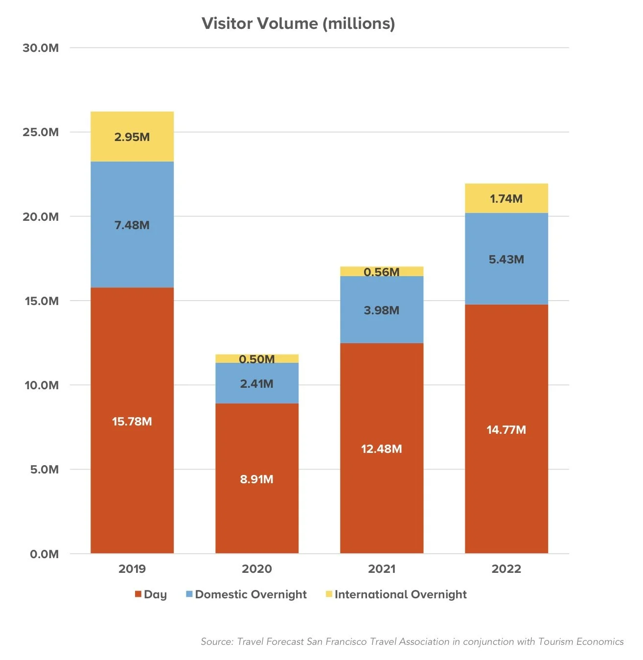
Despite these challenges, recent statistics from SF Travel paint a different picture, showcasing a resurgence in visitor volume. Although the pandemic led to a drastic decline in 2020, with visitor numbers halved, the city has experienced a steady recovery since then. In 2023, the forecasted visitor volume soared to an estimated 23.3 million, signaling a promising return to pre-pandemic levels of tourism activity.
Given the challenges faced by San Francisco's reputation during the COVID-19 pandemic, there's a clear need for a website that addresses the concerns of travelers while showcasing the city's true essence. By offering a platform that showcases the city's resilience and charm, it fulfills the desires of travelers seeking authentic and enriching experiences while dispelling any doubts or concerns they may have.
Understanding users and the market
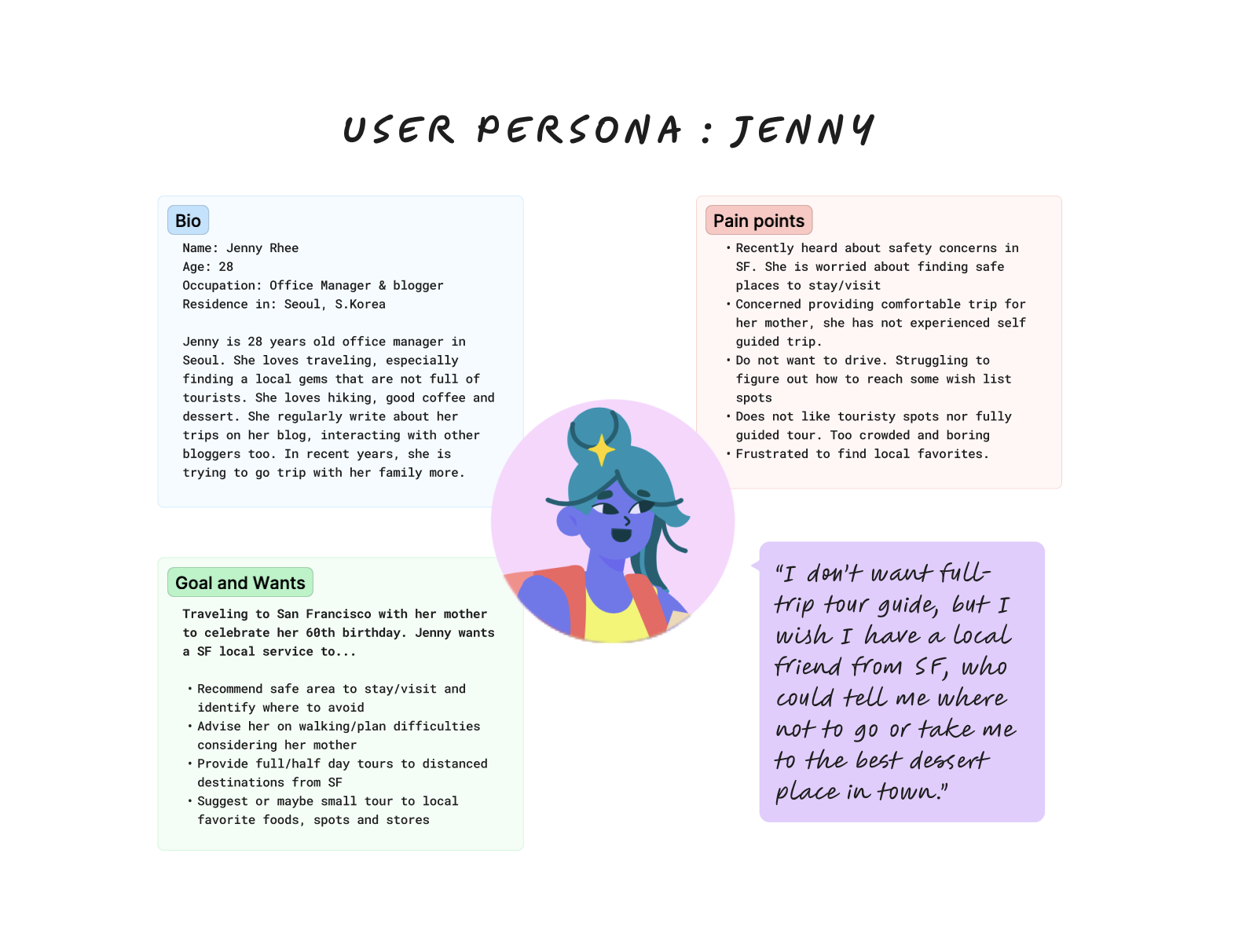
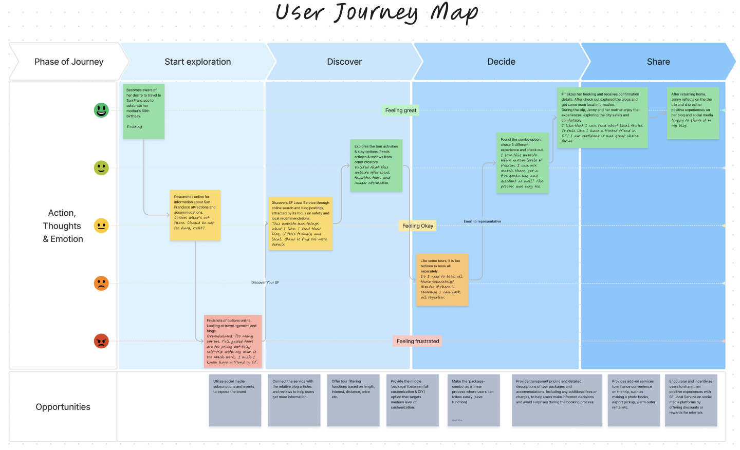
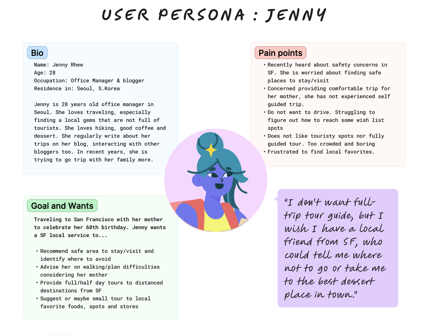
In this context, I created the User persona, Jenny and her User journey map.
Market Audit:
I conducted Market audits to explore what’s in the market for the users, to know the expectations and position in the market. I compared 5 Travel websites - Trip Advisor + Reco, Klook, Viator, The destination designers and Golden Horizon.
2. Prototype
By comprehending Jenny’s persona, her user journey map and the competitor audit, I gained profound insights into our target users' pain points, objectives, and areas for enhancement. Value statements are:
Offer a diverse array of personalization options tailored to varying customer preferences:
For customers seeking a fully customized travel experience, provide a comprehensive custom travel option facilitated by a representative.
Catering to customers desiring a semi-customized experience within a moderate budget, offer a 'combo' option allowing users to select preferences within a predefined travel framework.
For customers inclined towards a more DIY approach but still seeking a touch of local expertise within a lighter budget, present pre-made individual tour options that do not necessitate extensive customization commitments.
Content Integration:
Integrate blog articles, travel safety tips and destination guides within the platform to provide valuable insights and information for travelers.
Connect users with local experts or bloggers who can offer recommendations and insider tips for exploring destinations, adding authenticity and credibility to the platform.
Transparency and Trustworthiness:
Ensure transparency in pricing, terms, and conditions to build trust with users and alleviate concerns about hidden fees or surprises.
Provide clear and detailed information about safety, accommodation options, and tour inclusions to address Jenny's concerns about safety and comfort.
Non-clutter, User-Friendly Interface:
3 of 5 travel websites from the market audit presented cluttered layouts with excessive tours and information. The aim is to craft a simple, user-friendly interface that seamlessly navigates across different devices, ensuring an enjoyable experience.
User Flow
To understand the To delineate the user's steps on this prospective website, I created the user flowchart. Following the user flow chart, I gained better insights into how users will navigate and where key decisions will be made.To delineate the user's steps on this prospective website, I created the user flowchart. Following the user flow chart, I gained better insights into how users will navigate and where key decisions will be made.
Information Architecture
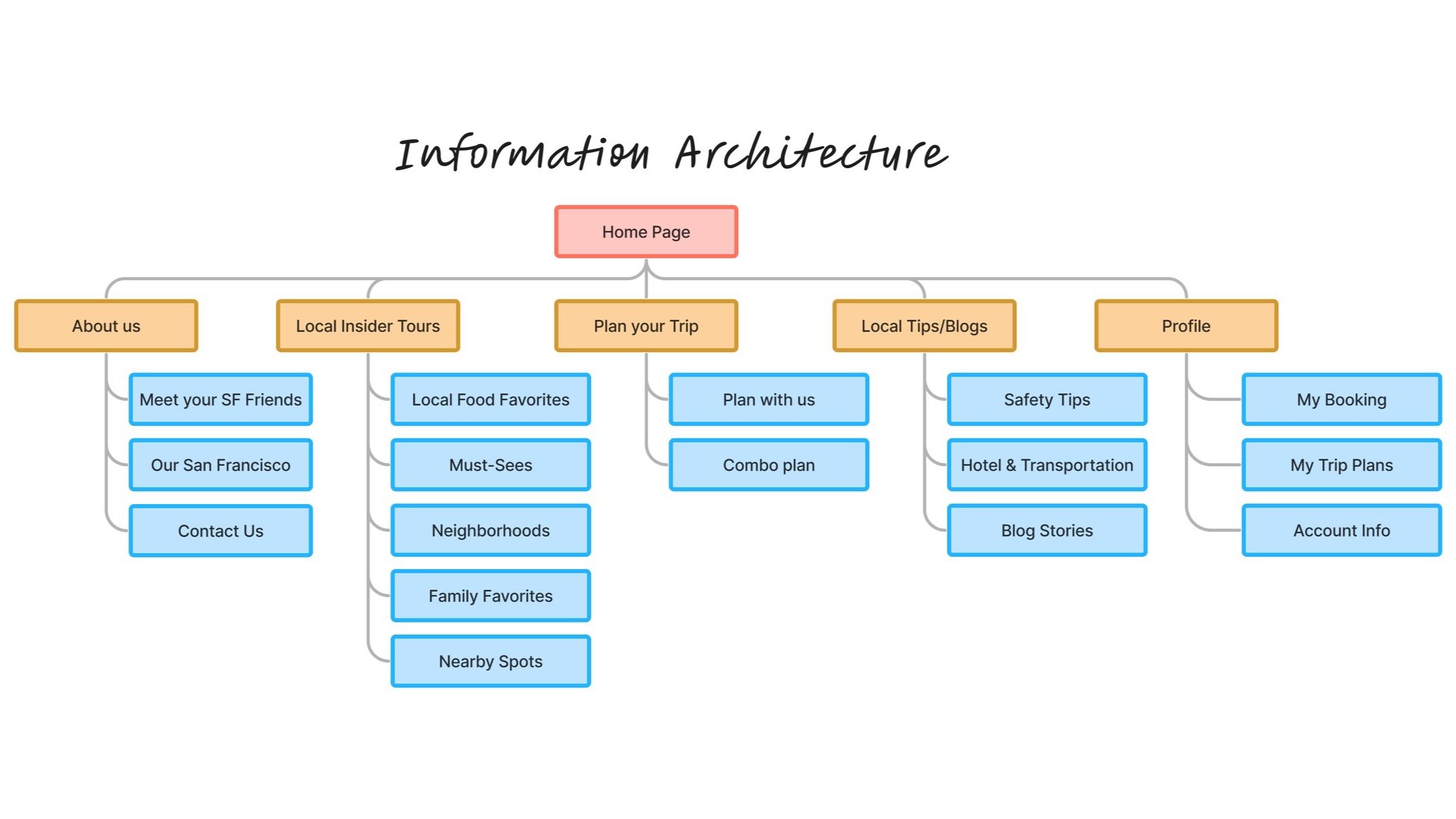
Based on the user flow, I developed the information architecture. Addressing the main issues observed in many travel websites, such as an overwhelming amount of information and cluttered layouts, I aimed to simplify and streamline navigation for users, ensuring they can easily find what they need without getting lost.
Wireframes
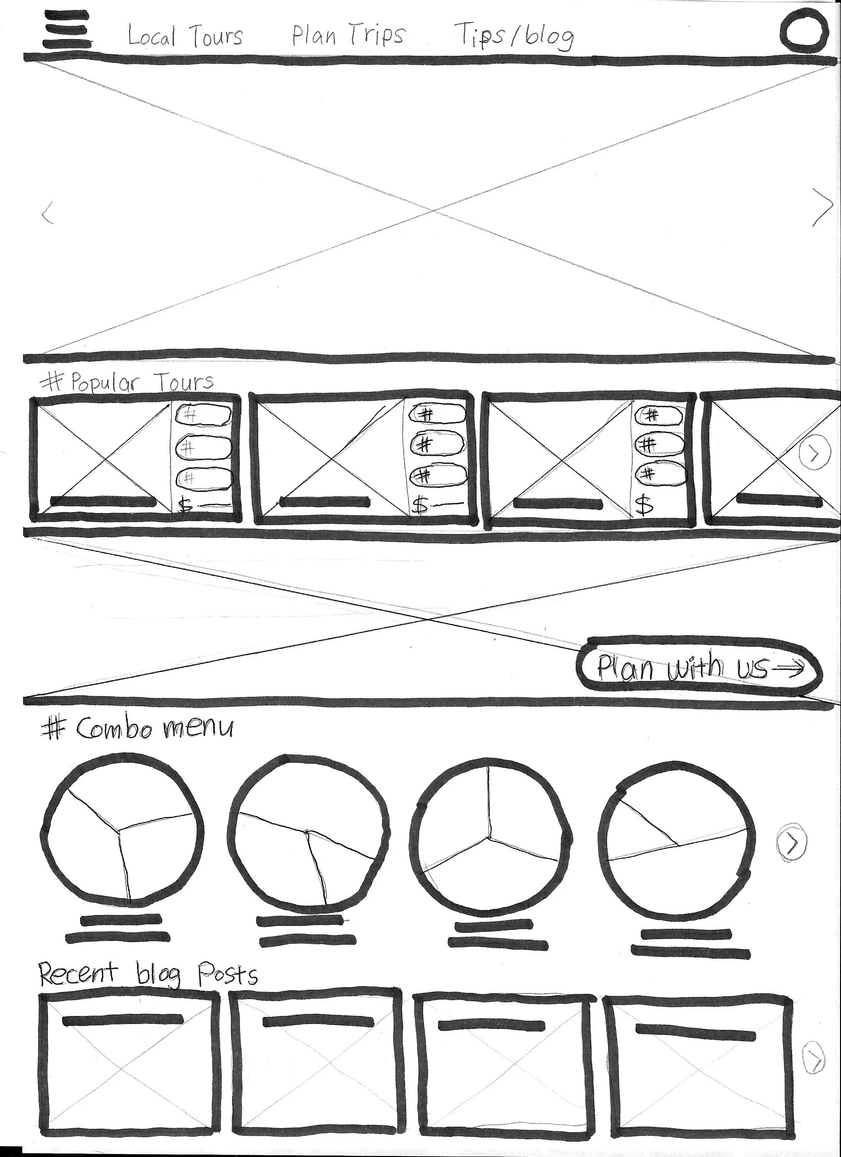
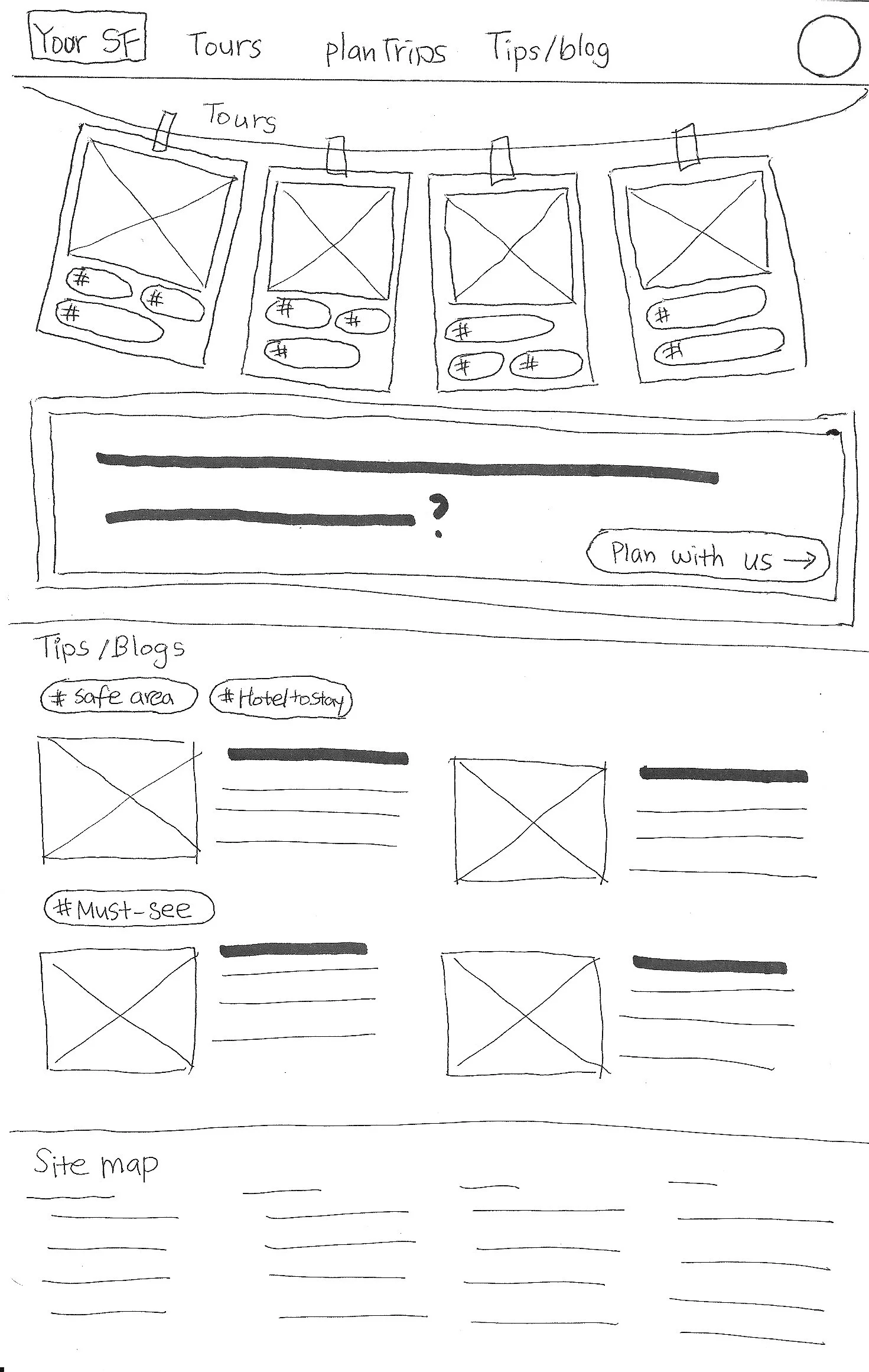
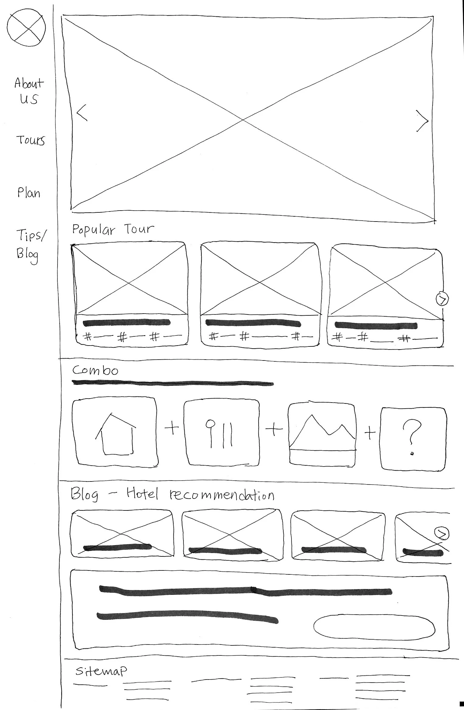
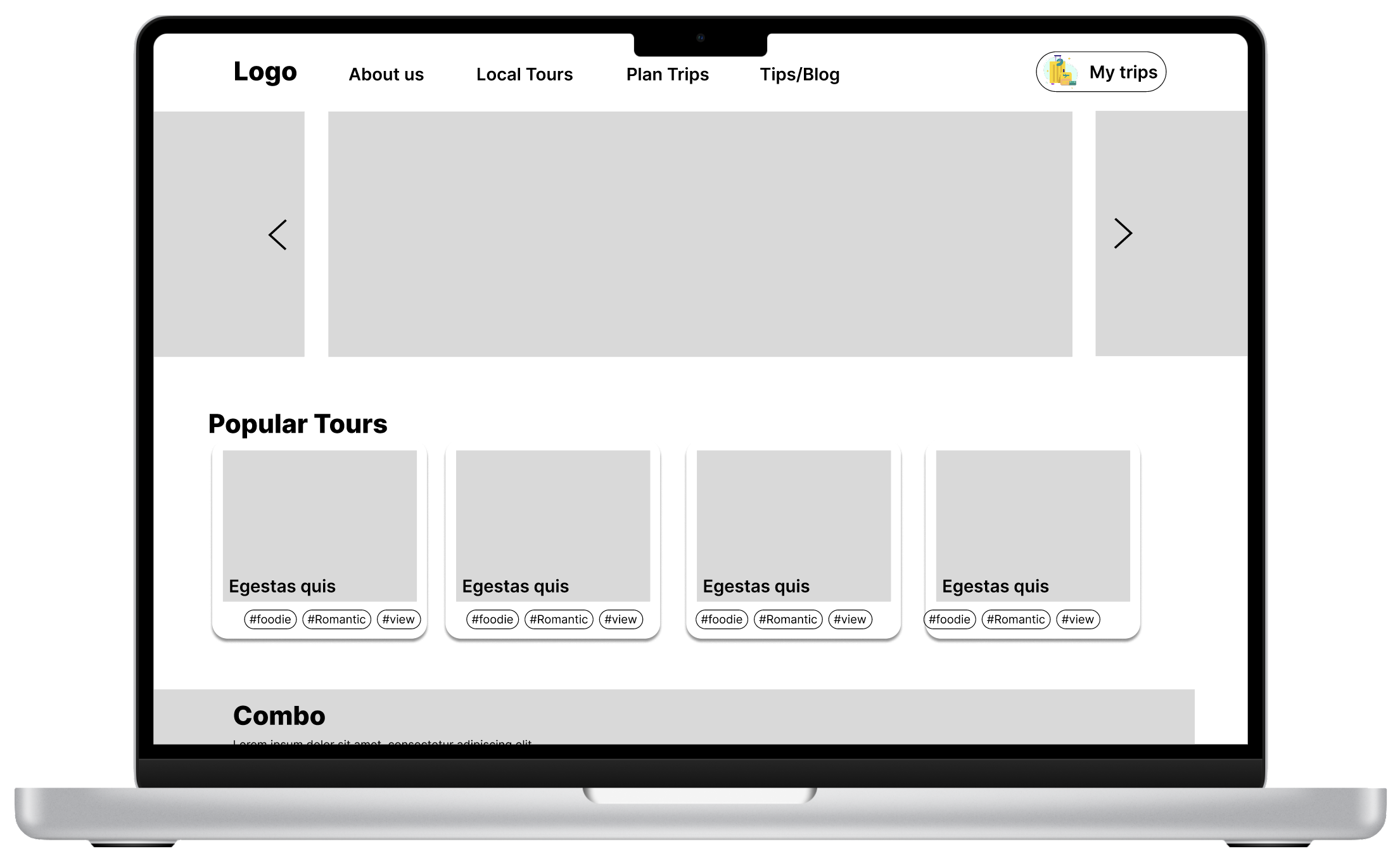
Based on the user flow and the AI, ideated the wireframes.
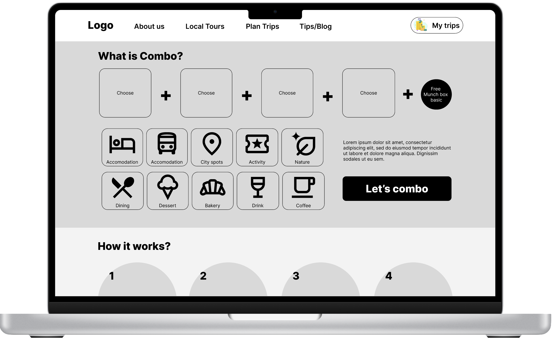
“Combo” Flow Prototype
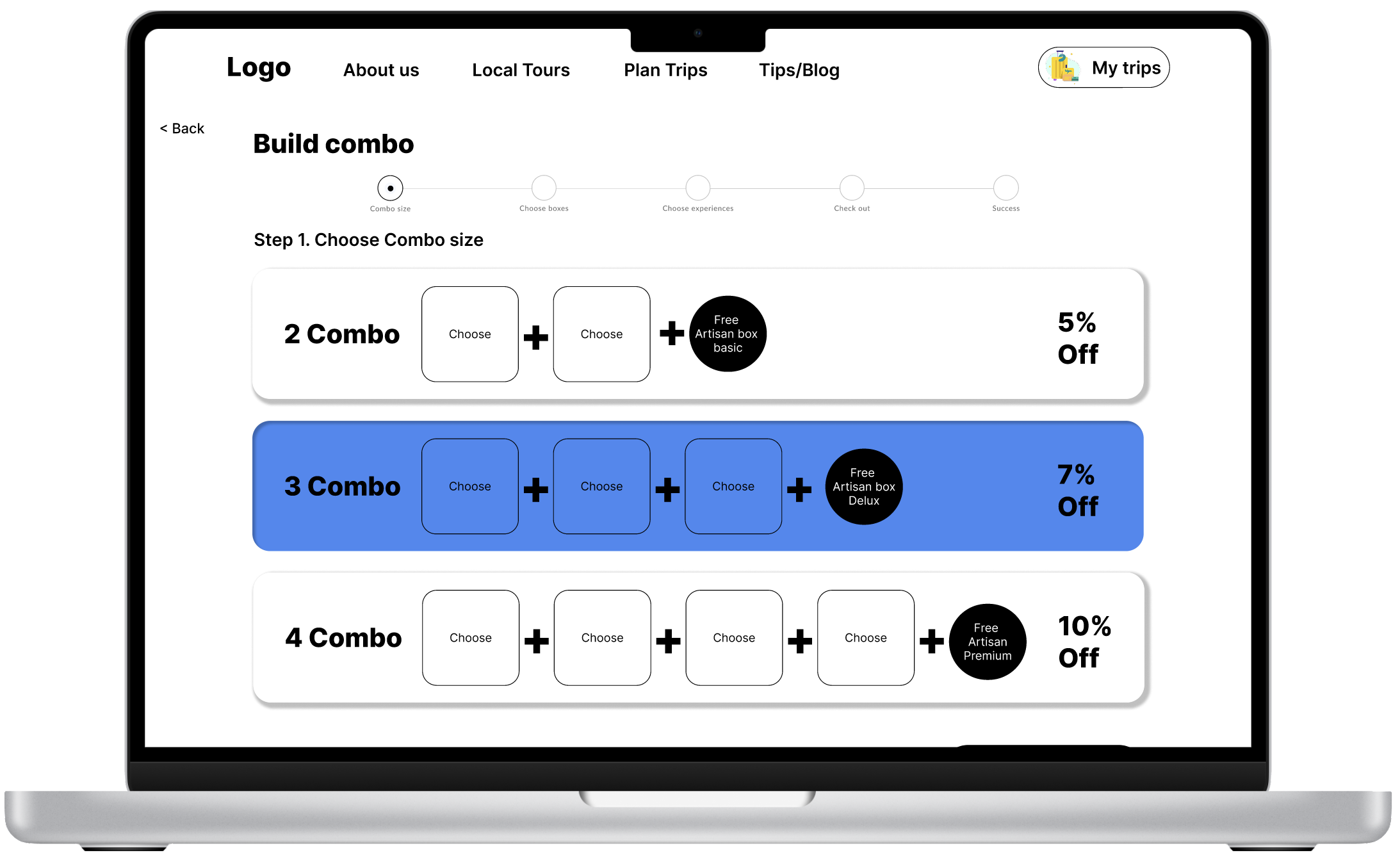
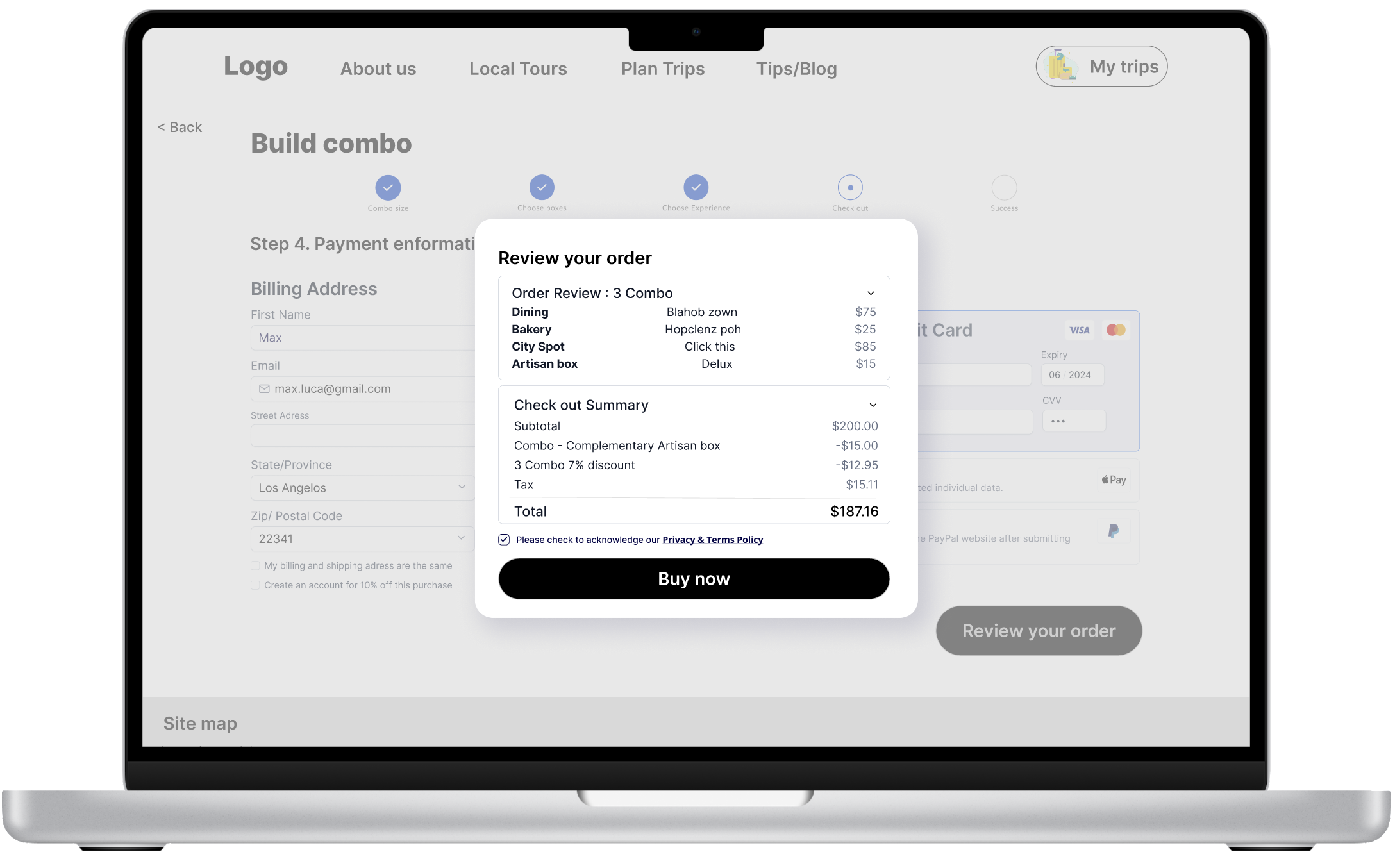
During this process, the primary focus was on developing the combo flow, which will serve as the unique product offering of the website. The combo product aims to provide a straightforward customization option where users can mix and match their preferred tours and activities, accompanied by discounts and a complimentary artisan snack box. This approach caters to the needs of target users like Jenny, who prefer a DIY trip but occasionally seek guided tours to discover local gems within a reasonable budget. Moreover, it will incentivize the purchase of multiple tours within our platform, thereby promoting sales and enhancing user engagement.
3. User test & Improve
User test : Moderated, 3 participants (1 male & 2 females, age: 30s)
During the usability testing and feedback phase, I aimed to gain insights on the following questions:
Is the flow intuitive for users to understand the concept of the 'combo' service and complete the booking process smoothly?
What are the positives?
Are there any areas that could be improved to enhance the user experience and make it easier?
>Positives:
Combo Feature: Users appreciated the combo feature, finding it a unique to mix & match.
Familiarity: The placement of buttons, features, and presentations (e.g., "My Trips," tour cards) felt familiar and intuitive to users.
Understanding the Service: The "How It Works" and "Compare" sections effectively helped users grasp the concept of the service.
Blog/Tour Connection: Users found the connection between the blog and tour suggestions after checkout to be a helpful feature.
3. Insights & Design improvement:
>>Common theme :
Oversized components : Overall, components sizes are too big, wasting spaces.
More informations and process should be provided to support the users to complete the tasks
>>Specific actions:
1) First step of combo: CTA not visible, lack of further information for the flow
P2: “(after clicking 3 combo, moving the curser around) What do I do now?”
At the first step-‘choose combo size’ page, the previous layout lacks clarity regarding following steps, and the oversized components may be interfering essential features (CTA is not visible without scroll).
2) Second step of combo: CTA not visible, components are too big
P1: “Here too, you need to scroll down to go next. Maybe the boxes are too big”
At the second step of the flow, 'Choose the Boxes', users expressed frustration about not being able to see important functions without scrolling and pointed out that the general component sizes were too big.
Upon reviewing the wireframe, I realized that it might not be clear that each box is a button and how to undo a selection as well.
To address these problems, I decided on two actions:
Resizing the Components: The components were resized to fit within the user’s screen size without requiring scrolling down.
Providing More Information: I incorporated the dropdown idea from the research (P3 suggestion). Users will receive additional information about the combo they chose, preventing them from feeling lost in the flow. The "Save & Proceed" CTA button will be included in this dropdown, making it easier for users to navigate to the next page.
To solve this problem, I implemented the following changes:
Resized Components: I resized the components so that all the categories and CTA buttons are visible without scrolling down.
Button Effects: Added a drop shadow effect to the boxes to make it clear that they are clickable buttons.
Instructions: Included short instructions on how to undo a selection.
3) 3rd step of combo: Lack of providing user progress info
P1. “I think it will be nice if I can see the progress I made here”
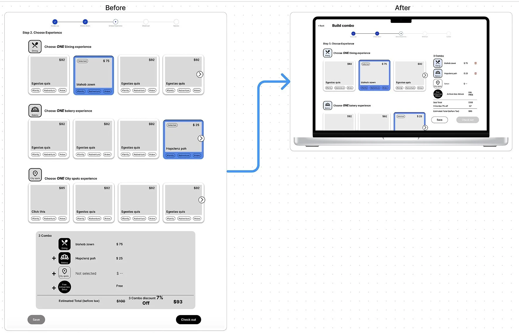
At the third step, 'Choose Experience,' users expressed a desire for a clearer visual representation of their progress—specifically, which activities they had selected and how many remained. In the previous layout, the progress summary was located at the bottom of the page and was not visible until users scrolled all the way down.
In my initial design ideation, the progress summary box was placed at the bottom, intending to mimic the common checkout process: adding items to the cart, showing the summary, and then checking out. However, based on user feedback, I realized that (even though there is a progress bar on the top) it's crucial to show users where they are and what's expected at each step to keep them engaged and informed.
To tackle the problem of users not seeing their progress summary until scrolling all the way down, I implemented the following changes:
Changed Location: Moved the progress summary box from the bottom of the page to the top right, alongside the experience card.
Downsized Components: Downsized unnecessarily large components and designed the progress summary box to mimic the look of a 'receipt' for user familiarity.
Sticky Scroll Behavior: Using Figma's 'sticky' scroll behavior, the progress summary box, including the CTA button, now follows the user as they scroll. This ensures users can always see their progress and have the option to check out at any time.
Added trash icons to delete

